
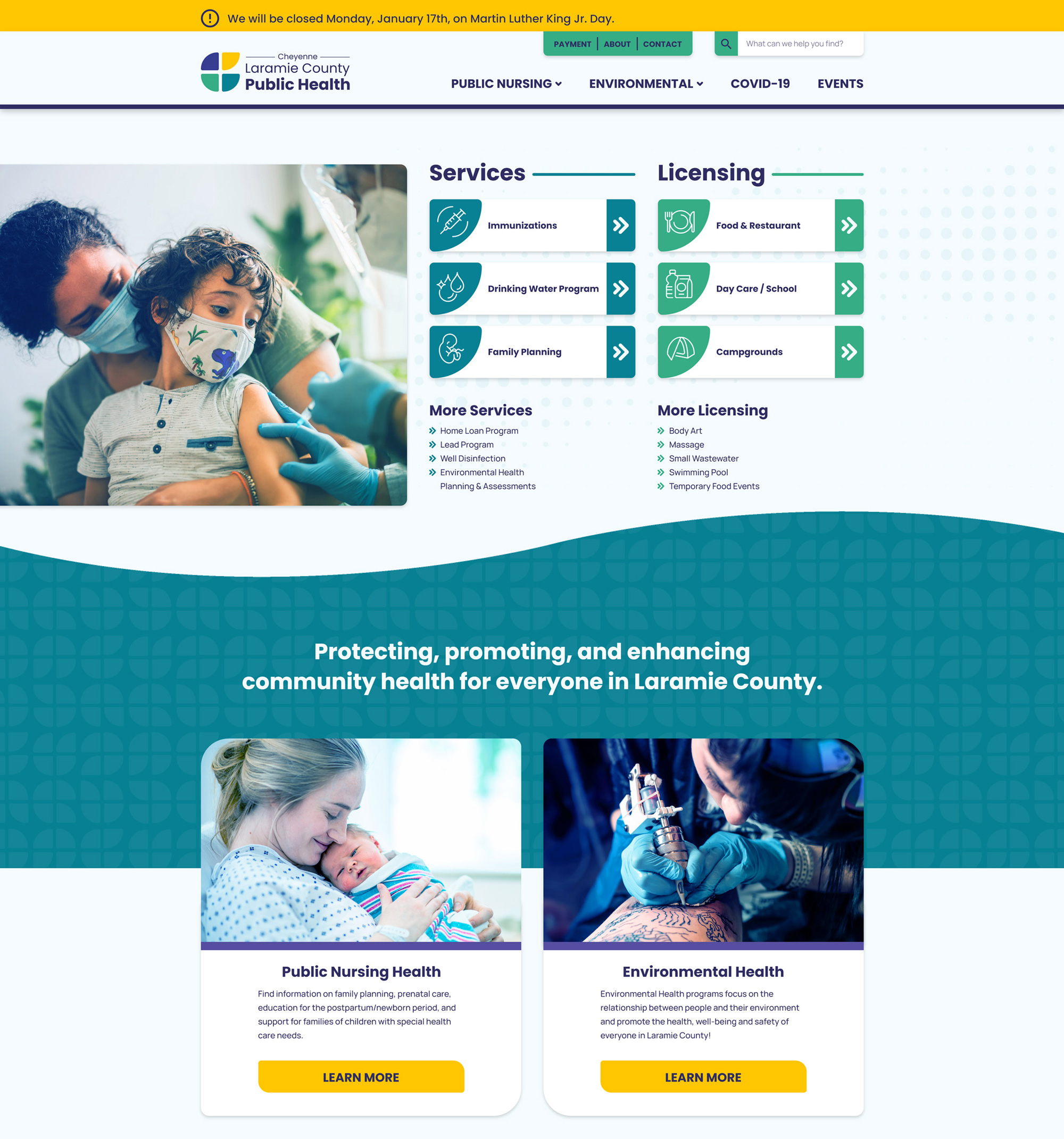
PROTECTING, PROMOTING, AND ENHANCING COMMUNITY HEALTH
Public Health
Cheyenne Laramie County Public Health has incredible avenues that improve and protect the community’s health and well-being with its programs and providers. Their team reached out to West Edge, because their current brand wasn’t conveying their incredible story. After an in-depth discovery meeting and workshop, we were able to really dive into their offerings and services for the community.
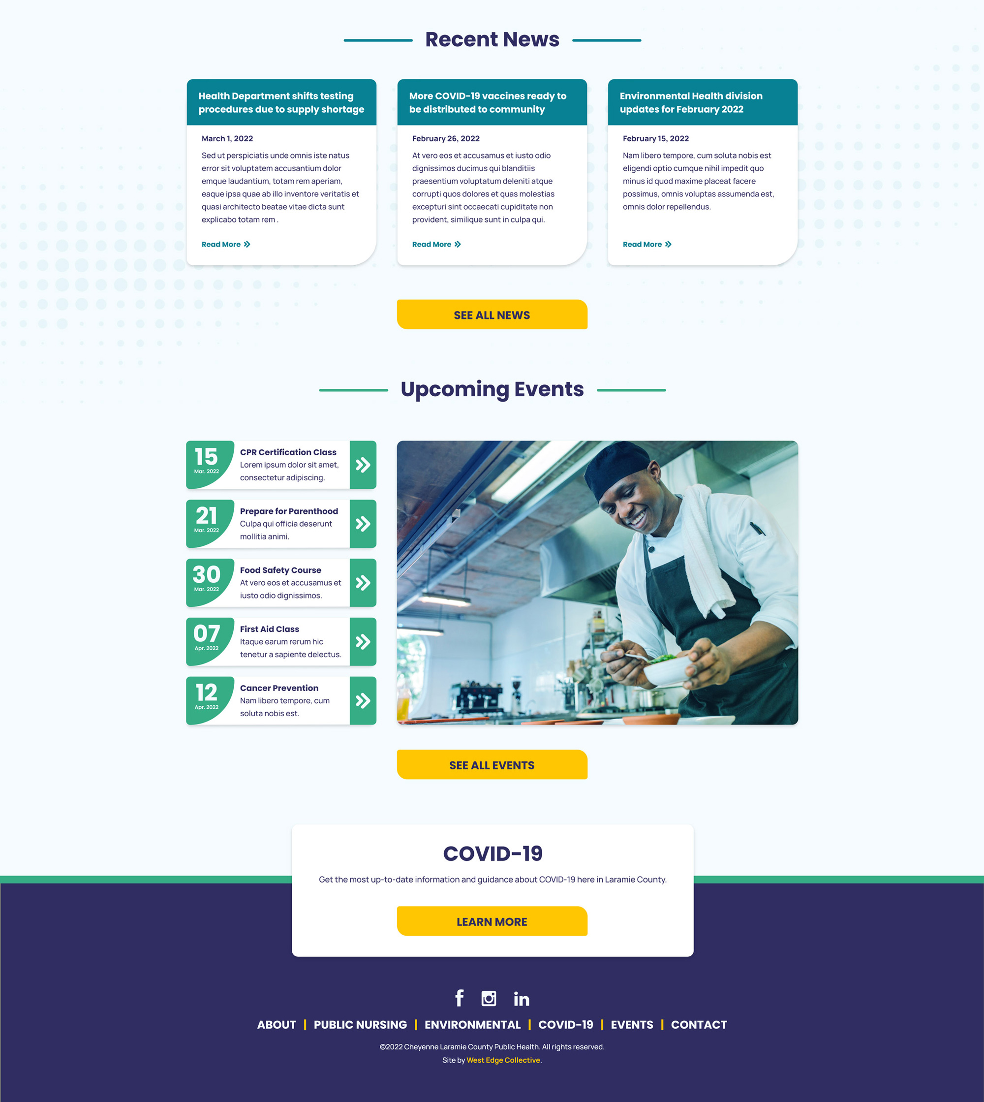
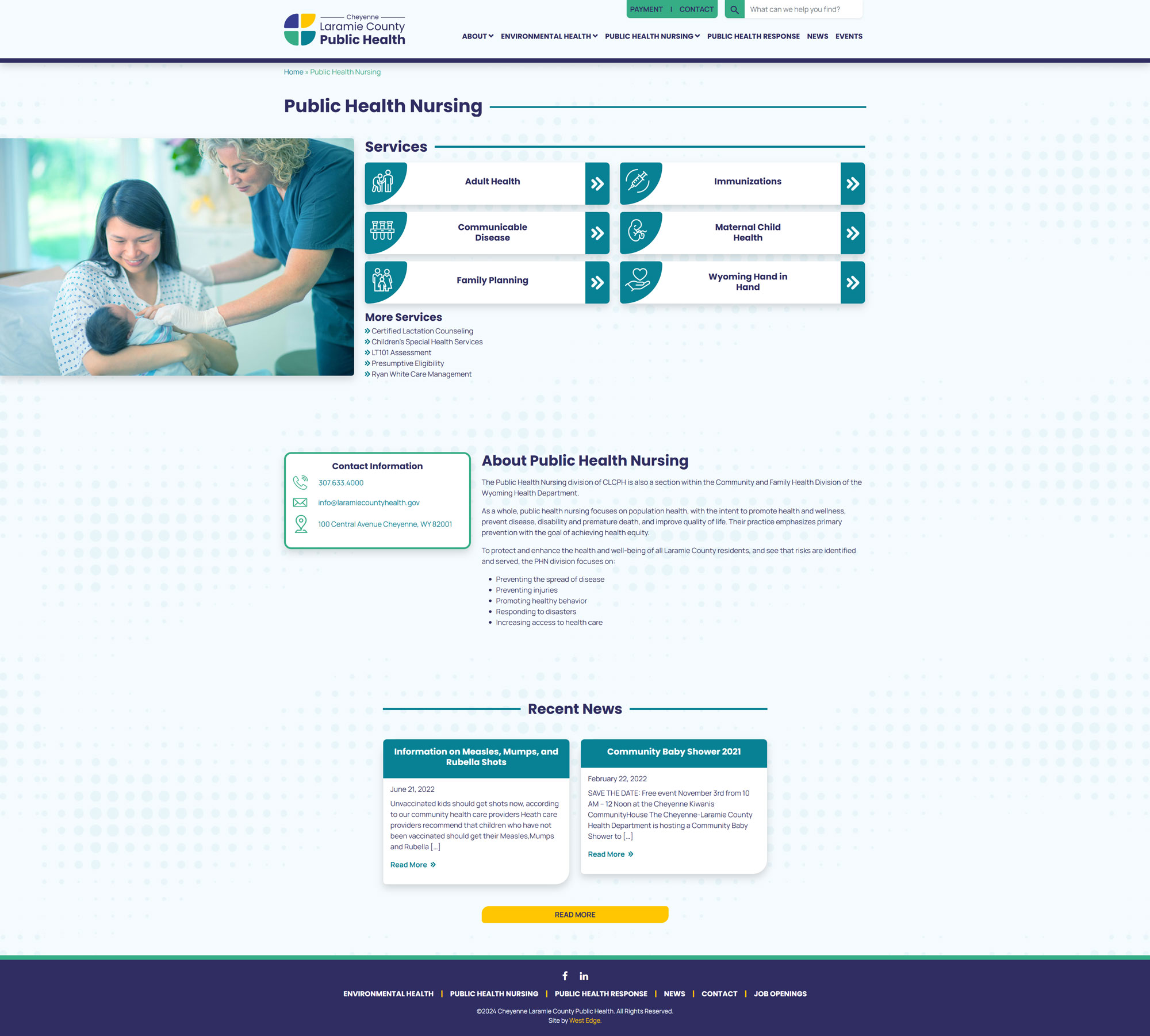
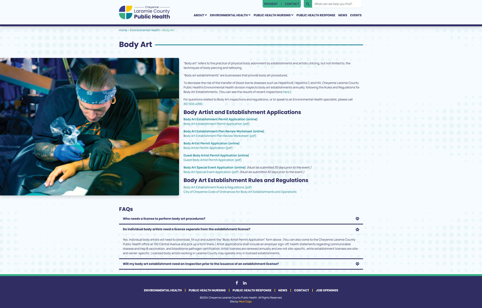
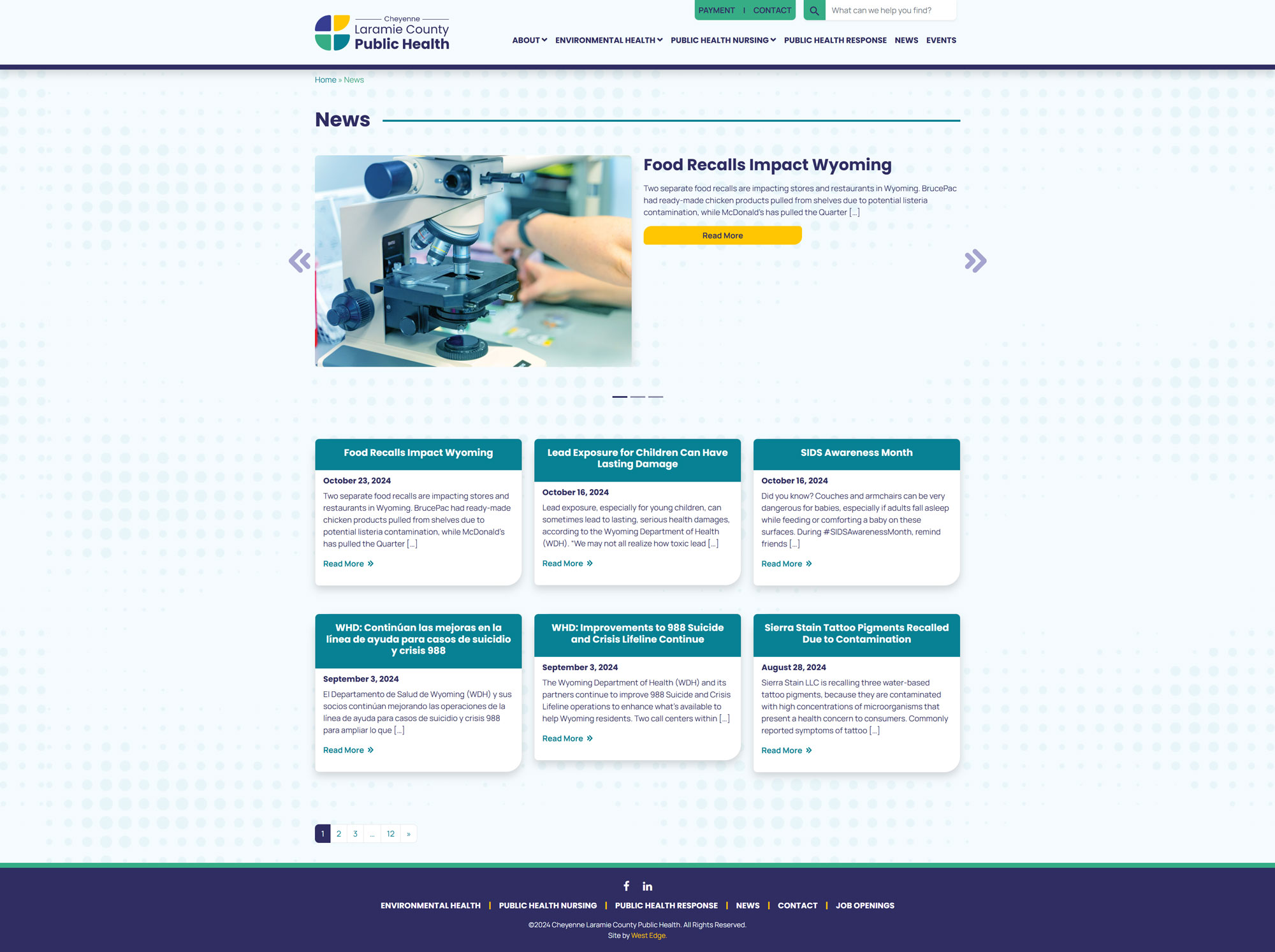
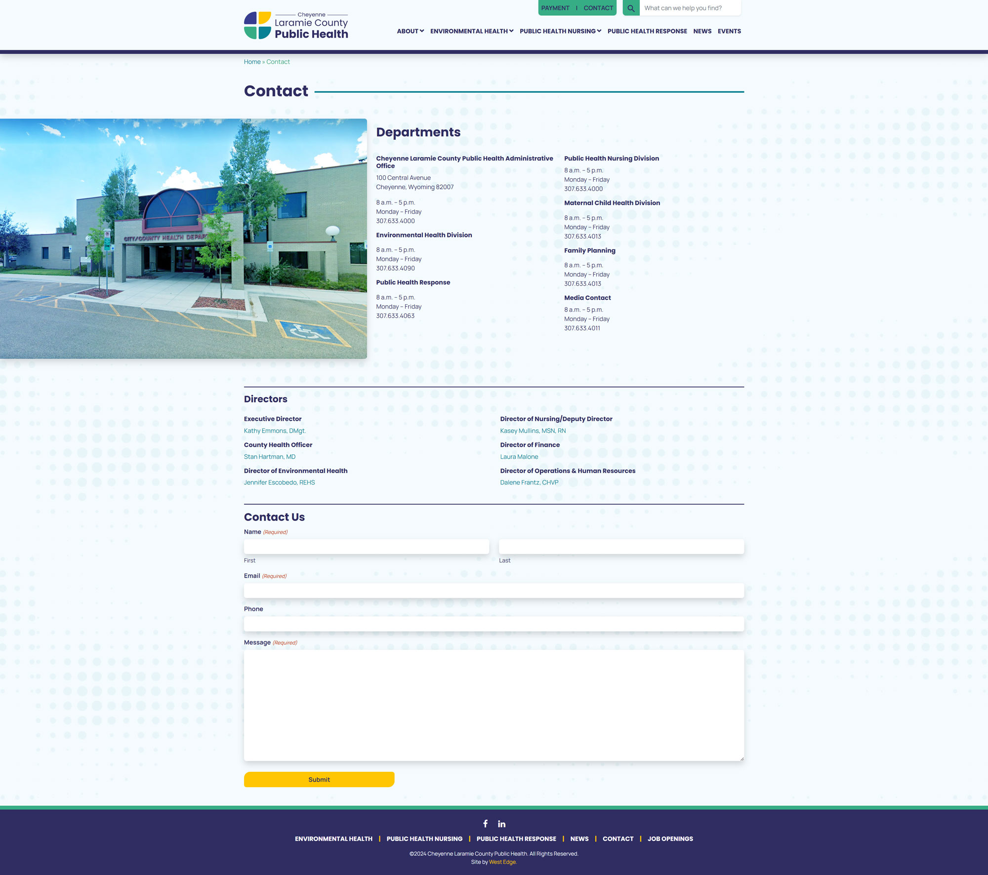
The team assisted CLCPH with rebranding and re-establishing the identity of their divisions and programs. In addition to creating a new logo, crafting brand messaging, and updating the brand’s overall look and feel, we completely rebuilt their website, redesigned their collateral, updated signage, and worked closely with the CLCPH team to develop a brand rollout strategy.
Role
Graphic Design
Client
Cheyenne Laramie
County Public Health
Agency
West Edge


OLD
NEW
CHALLENGE
Cheyenne Laramie County Public Health came to West Edge with an outdated brand that the team didn’t believe accurately represented the organization’s energy, quality of care, and professionalism. After doing a discovery meeting and a brand workshop, we discovered that the organization was struggling with the community not understanding who they were, what services they offered and had a lack of brand consistency. Our goal was to help rename (from Cheyenne-Laramie County Health Department to Cheyenne Laramie County Public Health) and reintroduce them to the community with new messaging and a new overall brand to position them as a community centric organization that offered high quality health care at an affordable rate.


APPROACH
After doing a discovery meeting and a brand workshop with the client, it was clear a logo needed to be designed that conveyed who they were as an organization. West Edge and the client settled on a handful of keywords that best described who Cheyenne Laramie County Public Health was, including: creative, responsive, caring, trustworthy, flexible, reliable, protective, nimble, and welcoming. Once these words were defined, I worked on creating some rough sketches of logo ideas that came to mind.
sketches
After sketching, it was time to take things to the computer and see what ideas translated the best to the keywords we had established. Typography and colors were chosen to compliment the brandmark and the brand’s personality.

brandmark concepts
After settling on a logo, a stylescape was created to give the client a sneak peak at the overall look and feel we were proposing for their new brand.
stylescape
Once the initial concept was approved, we began to focus on really nailing down who they were as an organization, visually and through messaging and positioning. We then swiftly moved into production, where I designed all of their collateral, including: stationery, posters, brochures, banners, booklet, signage, a website, a MRU vehicle wrap, and more.


IMPACT
Cheyenne Laramie County Public Health now has a modern, unified, professional brand that they are proud to show off and use. Updated brand messaging brought their mission—”Protecting, promoting, and enhancing community health for everyone in Laramie County”—to the forefront, supported by clear definitions of their three divisions: Environmental Health, Public Health Nursing, and Public Health Response. The organization now has the tools in place (including brand standards) to visually represent and talk about themselves in a consistent way and enrich the lives within the community they are passionate about.